Mid-Evaluation: Sound
This entry was posted on Monday, 26 April 2010
One of the things which I had most problems with was choosing sound to accompany my footage. I tried to make my own sound but after a number of attempts what I came up with was not good enough for my film. I looked for sound that would help build the tension without being too stereotypical of the horror genre. I found a sound that works well and have cut it so that it builds well with my visual sequence.
Mid-Evaluation: Title Animation
This entry was posted on Sunday, 18 April 2010
After the font was selected I needed to choose the right animation. Again, I came up with a shortlist of four and showed them to a group of people from my target audience.
I chose the winning animation as it was the groups favourite. The filickering connotes the horror genre. This helps to remind the audience to expect shocks along with other things associated with the horror genre.
Mid-Evaluation: Titles Font
This entry was posted on
In doing the titles for my opening sequence I looked at a number of fonts in an attempt to find the right font. In the end I drew up a shortlist of four possible fonts between which I was undecided.


To decide which font I would use I showed the shortlist to a group of people in my target audience. They decided on this font:

They decided on this font because the serif connoted the horror genre as well as the font still being simple.
Another choice that I had to make was about the case of the titles. I have decided to make all of the titles lower case. I have done, firstly because my target audience preferred it in lower case and secondly because it makes it seem more ordinary, the audience may not expect what is coming. The lower case is not stereotypical of the horror genre it subverts what is normally done.
Mid-Evaluation: Heartbeat sound
This entry was posted on Wednesday, 31 March 2010
I was not sure about putting a heartbeat sound effect on the shots of the woods, just before the victim was attacked. I believed that a positive was that they connoted the horror genre and therefore building up tension as the audience know something will happen. But a downside to this is that the sound effect maybe too common in the genre and will make my work seem less original.
I showed the footage to a group who I mainly believe to be my target audience (also to a few other people outside the target audience) to see what they felt. The opinion of the majority was that although it builds up some tension, it makes it too obvious that something will happen (taking away from when it does happen) and that the sound effect was 'too cheesy'. I have therefore decided to remove the sound effect.
I showed the footage to a group who I mainly believe to be my target audience (also to a few other people outside the target audience) to see what they felt. The opinion of the majority was that although it builds up some tension, it makes it too obvious that something will happen (taking away from when it does happen) and that the sound effect was 'too cheesy'. I have therefore decided to remove the sound effect.
Mid-Evaluation: Unusable shots
This entry was posted on

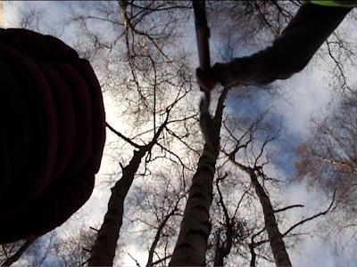
I like this shot when it is shown as a still, firstly because the tall leafless trees are typical, and connote, the horror genre that I am filming. The worms-eye view also gives the attacker a sillouheted figure which also connotes the genre. The reason that this shot cannot be used is, firstly that with the equipment I had it was impossible to do a shot in which the attacker actually hits the victim with the spade, and secondly the victim is standing still in the shot when in the shots before she had been walking.
Mid-Evaluation: Chroma key problems
This entry was posted on Wednesday, 17 March 2010

Along with the lighting problems I have had numerous problems with the chroma key. I am using chroma key on final cut to create a news reader scene. After I uploaded the first shot I realised that the cloth I used as a background was too wavy, i.e. the colour was not consistent. This made the chroma key uneven, not all of the background could be keyed out without removing some of the news reader. After the second shots were uploaded I found that the flat background clashed too much with the news readers jacket. Again I could not remove the whole background. I will make sure that the colour is bright enough so not to clash with the news readers clothes. I will also make sure it is a solid background for my next attempt.


